10 CSS Features That Actually Work Everywhere Now (2025)
Articles | Nov 20 2025 | Tom Von Lahndorff
10 CSS Features That Actually Work Everywhere Now (2025)
CSS has changed a lot in the past few years. Features that used to require JavaScript or preprocessors are now native. Things that seemed impossible are now standard.
The performance impact is huge. Native CSS runs faster than JavaScript, doesn't block the main thread, and gets optimized by the browser automatically. Less JavaScript means faster page loads, better responsiveness, and simpler code.
Here are 10 CSS features that have reached solid browser support in 2025 - meaning you can actually use them in production without polyfills or hacks.
1. Container Queries
What it does: Style elements based on their container size, not the viewport.
For years we've been stuck with media queries that only respond to viewport width. Container queries change the game - now a component can be responsive based on its parent's size.
.card-container {
  container-type: inline-size;
}

@container (min-width: 400px) {
  .card {
    display: grid;
    grid-template-columns: 1fr 2fr;
  }
}
Why it matters: Build truly modular components that adapt to any context. Drop a card component in a sidebar or main content area and it automatically adjusts. No more component-specific media queries.
Browser support: Chrome, Firefox, Safari, Edge - all good to go.
2. The :has() Selector
What it does: Style parent elements based on their children. The "parent selector" we've wanted for 20 years.
/* Style a card differently if it contains an image */
.card:has(img) {
  display: grid;
  grid-template-columns: 200px 1fr;
}

/* Style a form when inputs are invalid */
form:has(input:invalid) {
  border: 2px solid red;
}
Why it matters: No more JavaScript to add classes to parents. You can style upward in the DOM tree, opening up layout possibilities that used to require scripting. This alone can eliminate hundreds of lines of JavaScript and event listeners from your codebase.
Performance: Pure CSS selector - zero JavaScript overhead, instant browser optimization.
Browser support: Everywhere. Even Safari caught up.
3. CSS Nesting
What it does: Nest selectors like you do in Sass, but natively.
.card {
  padding: 20px;

  &:hover {
    transform: scale(1.05);
  }

  .title {
    font-size: 1.5rem;
  }
}
Why it matters: Cleaner, more organized stylesheets without a build step. Your CSS structure can mirror your HTML structure.
Browser support: Native in all modern browsers as of 2024.
4. Subgrid
What it does: Let nested grids inherit track definitions from their parent grid.
Before subgrid, creating aligned nested layouts was a pain. Now child grids can participate in the parent grid's track system.
.parent {
  display: grid;
  grid-template-columns: 1fr 1fr 1fr;
}

.child {
  display: grid;
  grid-template-columns: subgrid;
  /* Now inherits the 3-column layout */
}
Why it matters: Perfect alignment in complex layouts. Card grids where every card's content aligns across rows, even when nested. No more wrestling with margins and padding to fake alignment.
Browser support: Finally everywhere in 2025.
5. Cascade Layers (@layer)
What it does: Control the cascade order by organizing styles into named layers.
@layer reset, base, components, utilities;

@layer reset {
  * { margin: 0; padding: 0; }
}

@layer components {
  .button { padding: 10px 20px; }
}

@layer utilities {
  .mt-10 { margin-top: 10px; }
}
Why it matters: No more specificity wars. Define your cascade order explicitly. Framework styles don't accidentally override your custom styles. Utility classes can win without !important.
Browser support: Solid across the board.
6. New Viewport Units (svh, lvh, dvh)
What it does: Fixes the mobile browser chrome problem.
The old vh unit doesn't account for mobile browser UI that appears/disappears. The new units do:
svh- Small viewport height (browser chrome visible)lvh- Large viewport height (browser chrome hidden)dvh- Dynamic viewport height (adjusts as chrome shows/hides)
.hero {
  height: 100dvh; /* Actually full screen on mobile */
}
Why it matters: Full-height sections that actually work on mobile. No more "hero section with scrollbar" bugs.
Browser support: Available everywhere now.
7. accent-color
What it does: Style form controls with one property.
input[type="checkbox"],
input[type="radio"] {
  accent-color: #cc9966;
}
Why it matters: No more custom checkbox styling nightmares. Brand your forms instantly without rebuilding controls from scratch.
Browser support: Works everywhere.
8. color-mix()
What it does: Blend colors directly in CSS.
:root {
  --primary: #cc9966;
}

.button {
  background: var(--primary);
}

.button:hover {
  background: color-mix(in srgb, var(--primary) 80%, white);
  /* 80% primary, 20% white = lighter on hover */
}
Why it matters: Dynamic color variations without preprocessors. Create hover states, disabled states, and theme variations on the fly.
Browser support: Available in all modern browsers.
9. Scroll-Driven Animations
What it does: Trigger animations based on scroll position without JavaScript.
@keyframes fadeIn {
  from { opacity: 0; }
  to { opacity: 1; }
}

.element {
  animation: fadeIn linear;
  animation-timeline: view();
}
Why it matters: Performant scroll effects without event listeners or Intersection Observer. The browser optimizes these animations natively.
Performance: Runs on the compositor thread - buttery smooth 60fps animations without blocking JavaScript execution. Way more performant than scroll event listeners.
Browser support: Chrome and Edge have it. Safari and Firefox support coming. Use with progressive enhancement.
10. Trigonometric Functions (sin, cos, tan)
What it does: Use actual math in CSS calculations.
.circle-item:nth-child(1) {
  --angle: 0deg;
  transform: rotate(var(--angle))
             translateX(150px)
             rotate(calc(-1 * var(--angle)));
}

/* Or with trig for circular layouts */
.item {
  left: calc(50% + 150px * cos(var(--angle)));
  top: calc(50% + 150px * sin(var(--angle)));
}
Why it matters: Circular layouts, wavy patterns, and mathematical animations without JavaScript. Pure CSS can now do real geometry.
Performance: Calculations happen at render time, fully optimized by the browser. No runtime JavaScript math overhead.
Browser support: Everywhere since 2024.
The Bottom Line
These aren't experimental features anymore. They're production-ready tools that make CSS more powerful and JavaScript less necessary. Container queries alone eliminate so many media query hacks. The :has() selector solves problems that used to require scripting. Scroll-driven animations replace hundreds of lines of scroll event listeners.
The performance gains are real. Every feature that moves from JavaScript to native CSS means:
- Faster page loads (less JavaScript to parse and execute)
- Smoother interactions (browser-optimized rendering)
- Simpler codebases (less to maintain and debug)
- Better mobile performance (CSS is way lighter than JS)
2025 is a good time to be writing CSS. These features are here, they work, and they make our lives easier. Start using them and watch your JavaScript bundle shrink.


Find the Unicorns
Articles | May 9 2026 | Tom Von Lahndorff
I've been called a unicorn a few times in my career. Usually it's because I cross between design and development — I can build the thing and make it look right. In tech, this combination is rare enough that people pull out the word and use it like a compliment, but also like they're describing a
Building a Better Lighting Control App with AI
Articles | Apr 14 2026 | Tom Von Lahndorff
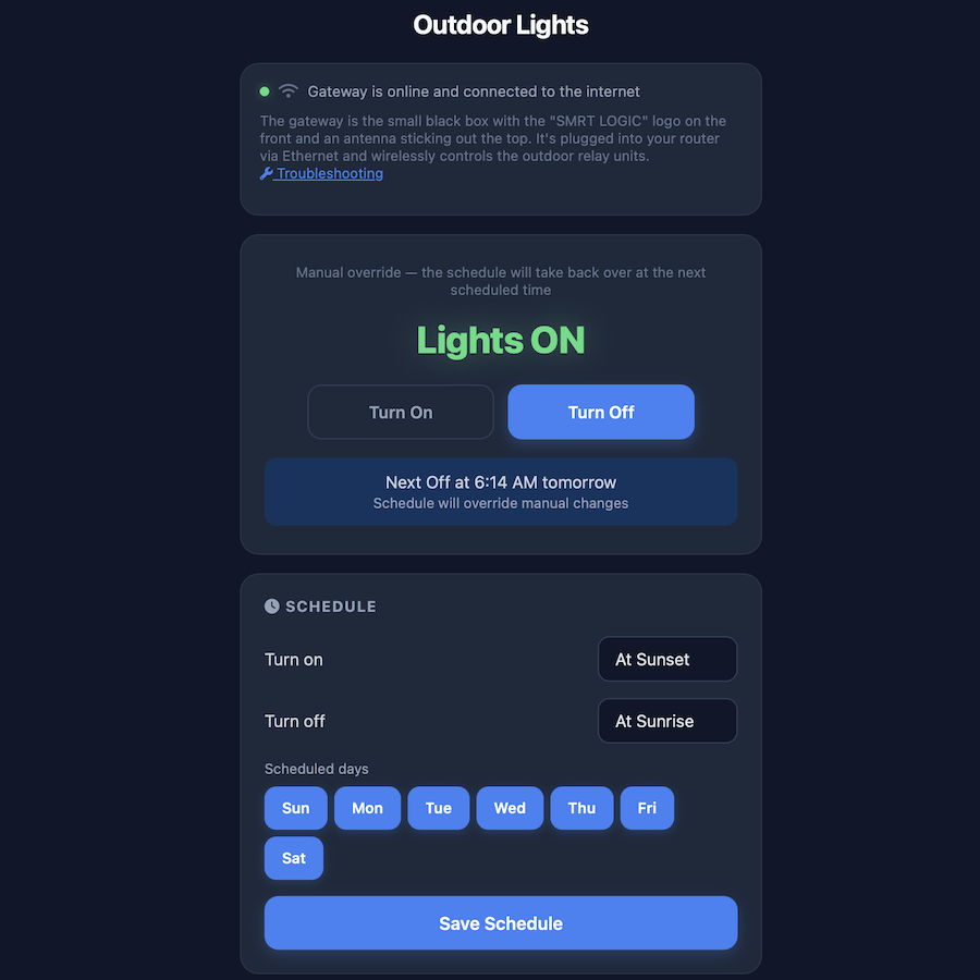
I have an outdoor lighting system at my house — the kind with a gateway, relay controllers, and scheduling based on sunset and sunrise times. The hardware itself is solid. The manufacturer's app? Not so much. It was slow, buggy, and clearly designed as an afterthought. Simple things like

10 CSS Features That Actually Work Everywhere Now (2025)
Articles | Nov 20 2025 | Tom Von Lahndorff
CSS has changed a lot in the past few years. Features that used to require JavaScript or preprocessors are now native. Things that seemed impossible are now standard. The performance impact is huge. Native CSS runs faster than JavaScript, doesn't block the main thread, and gets optimized by the

Top 10 Tips for Working with Claude Code
Articles | Nov 15 2025 | Tom Von Lahndorff
Working with Claude Code (Anthropic's official CLI for AI-assisted development) has been a game-changer for my development workflow. Over the past few months, I've used it across several projects - refactoring legacy code, building new features, and optimizing performance. Through trial and error,